Design Systems That Scale With Your Team
A design system is the single source of truth that keeps your product consistent, your designers efficient, and your developers happy. InterCode builds component libraries, design tokens, and documentation that eliminate redundancy and accelerate feature delivery.
One System, Infinite Consistency
As products grow and teams scale, design consistency becomes exponentially harder to maintain. Buttons look different across pages, spacing is inconsistent, and developers spend hours recreating components that already exist somewhere in the codebase. A well-built design system solves all of these problems.
InterCode designs and engineers complete design systems that bridge the gap between Figma and code. We create component libraries with documented APIs, design tokens that ensure visual consistency, and usage guidelines that help new team members ship consistent UI from day one.
Our design systems are not static PDFs that gather dust. They are living, versioned artifacts integrated into your development workflow with automated visual regression testing that catches unintended changes before they reach production.
What We Deliver
Complete design system engineering from tokens to testing.
Design Token Architecture
Color, spacing, typography, and shadow tokens that centralize your visual language in a single source of truth.
- Platform-agnostic token format
- Theme support for dark/light modes
Component Library
Production-ready UI components with consistent APIs, accessibility support, and comprehensive prop documentation.
- Accessible by default (WCAG 2.1)
- Variant and state coverage
Documentation & Guides
Interactive documentation with usage examples, do/don't guidelines, and copy-paste code snippets.
- Storybook-powered documentation
- Pattern usage guidelines
Visual Regression Testing
Automated screenshot comparisons that catch unintended visual changes before they reach production.
- Chromatic integration
- PR-level visual review
Cross-Platform Consistency
Design systems that work across web, mobile, and native platforms from a shared token foundation.
- React and React Native support
- iOS and Android token export
Our Design System Process
Audit & Inventory
We catalog your existing UI patterns, identify inconsistencies, and prioritize which components to systematize first.
- Component inventory spreadsheet
- Inconsistency heatmap
Token Foundation
Define the design tokens that form the mathematical backbone of your visual language.
- Color, spacing, and type scales
- Semantic token naming
Component Design
Design each component in Figma with all variants, states, and responsive behaviors documented.
- Figma component library
- Auto-layout and variants
Component Engineering
Build production-ready components with proper TypeScript types, accessibility, and Storybook stories.
- React/Vue/Angular support
- Full accessibility audit
Testing & CI
Set up visual regression testing and component testing in your CI pipeline.
- Chromatic visual review
- Unit and interaction tests
Rollout & Adoption
Migrate existing pages to the design system and train teams on usage and contribution guidelines.
- Migration plan and tracking
- Contribution workflow docs
Design System Tools
Modern tooling for building, documenting, and maintaining design systems.
We build design systems on top of proven primitives like Radix UI and Tailwind CSS, combining accessibility out of the box with rapid customization through design tokens.
Client Results
Cut UI development time in half by replacing ad-hoc styling with a shared component library used across 8 product teams.
Achieved pixel-perfect brand consistency across web, iOS, and Android with a unified token-based design system.
Reduced design debt by 70% over 6 months by migrating 200+ screens to a systematized component library.
Why InterCode for Design Systems
Design + Engineering
Our team includes both designers and frontend engineers, ensuring the system works perfectly in both Figma and code.
Accessibility First
Every component meets WCAG 2.1 AA standards out of the box, with keyboard navigation and screen reader support built in.
Living Systems
Our design systems are versioned, tested, and continuously maintained, not static deliverables that rot over time.
Adoption-Focused
We design for team adoption with clear documentation, migration guides, and contribution workflows that encourage usage.
From Our Blog
Insights and practical guides from our engineering team

How to Monetize Your SaaS Application: Pricing Models and Strategies for Success
Learn how to maximize revenue and build a loyal user base for your SaaS, including value-based pricing tiers. Start optimizing your SaaS now!
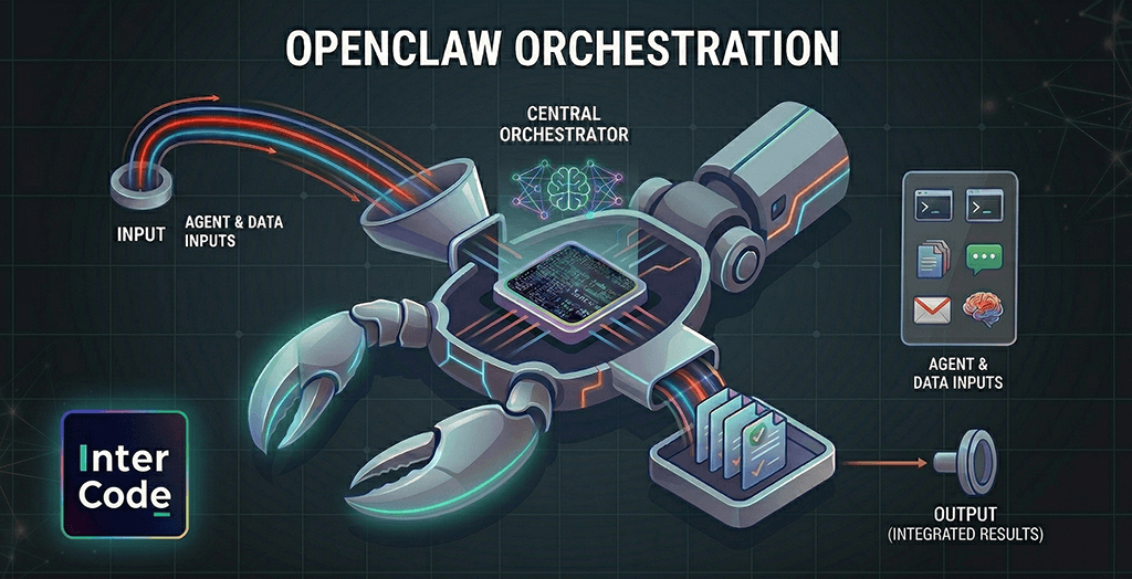
Multi-agent orchestration in OpenClaw: how does it work under the hood?
OpenClaw seems like AGI, but it's pure engineering. Discover the five input types that drive this open-source agent runtime to appear proactive.

Flutter 2026 Technical Review: UI Thread Merge, GenUI, and the Death of Native vs. Cross-Platform
Explore why Flutter dominates cross-platform mobile development in 2026. Discover key updates like the UI Thread merge, native Swift support on Android
Frequently Asked Questions
A design system becomes valuable when your product has multiple screens with shared patterns, or when multiple designers and developers are building UI simultaneously. If you are seeing inconsistency across your product or duplicated effort in building common components, it is time to invest.
A foundational design system with tokens, 15-20 core components, and documentation typically takes 6-10 weeks. We recommend starting with the most-used components and expanding incrementally rather than trying to systematize everything at once.
Yes. We start with an audit of your existing UI to identify patterns and inconsistencies. We then build the system to match your current brand while resolving inconsistencies, and provide a migration plan to update existing pages.
We build design system components in React, Vue, Angular, and Svelte. React with TypeScript is our most common implementation. We can also create framework-agnostic web components if you need to support multiple frameworks.
We establish a contribution model where teams can propose new components through a defined process. Visual regression testing in CI catches unintended changes, and versioned releases ensure teams can adopt updates at their own pace.
Ready to Systematize Your Design?
Tell us about your product and team size. We will design a system that brings consistency to your UI and speed to your development process.
Contact Us